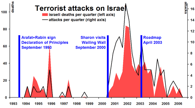
Data is taken from this page of the Israeli Govt website. Black shows number of terrorist attacks against Israel, per quarter. Red shows the number killed by the attacks per quarter (not including the attackers themselves). So, the total red area is the total number killed.
How to interpret the graph: If I knew how to interpret the graph, then I could solve the Middle East problem! Actually I can, since the data has an unambiguous message: when there was negotiation with Arafat, and no Sharon, then Israelis stopped dieing.
Some might accuse me of being callous, of reducing all the Israeli suffering to just numbers. I'm not. I believe that statistics can show us the truth about the situation, in a way that rhetoric cannot, and that statistics can show the best practical means to reduce suffering in the region.